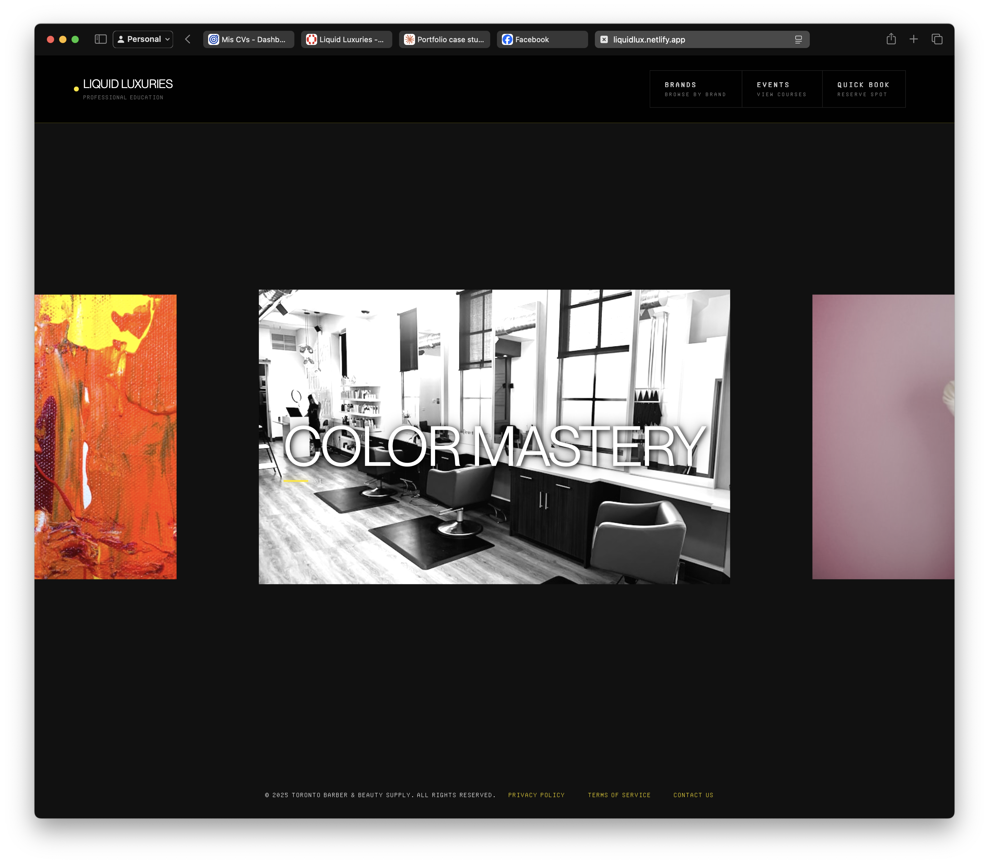
Project Overview
Professional education and booking platform for Toronto Barber & Beauty Supply, designed to help busy beauty professionals discover and reserve educational courses across multiple brands. The project focused on streamlining discovery, reducing decision fatigue, and creating efficient booking experiences.
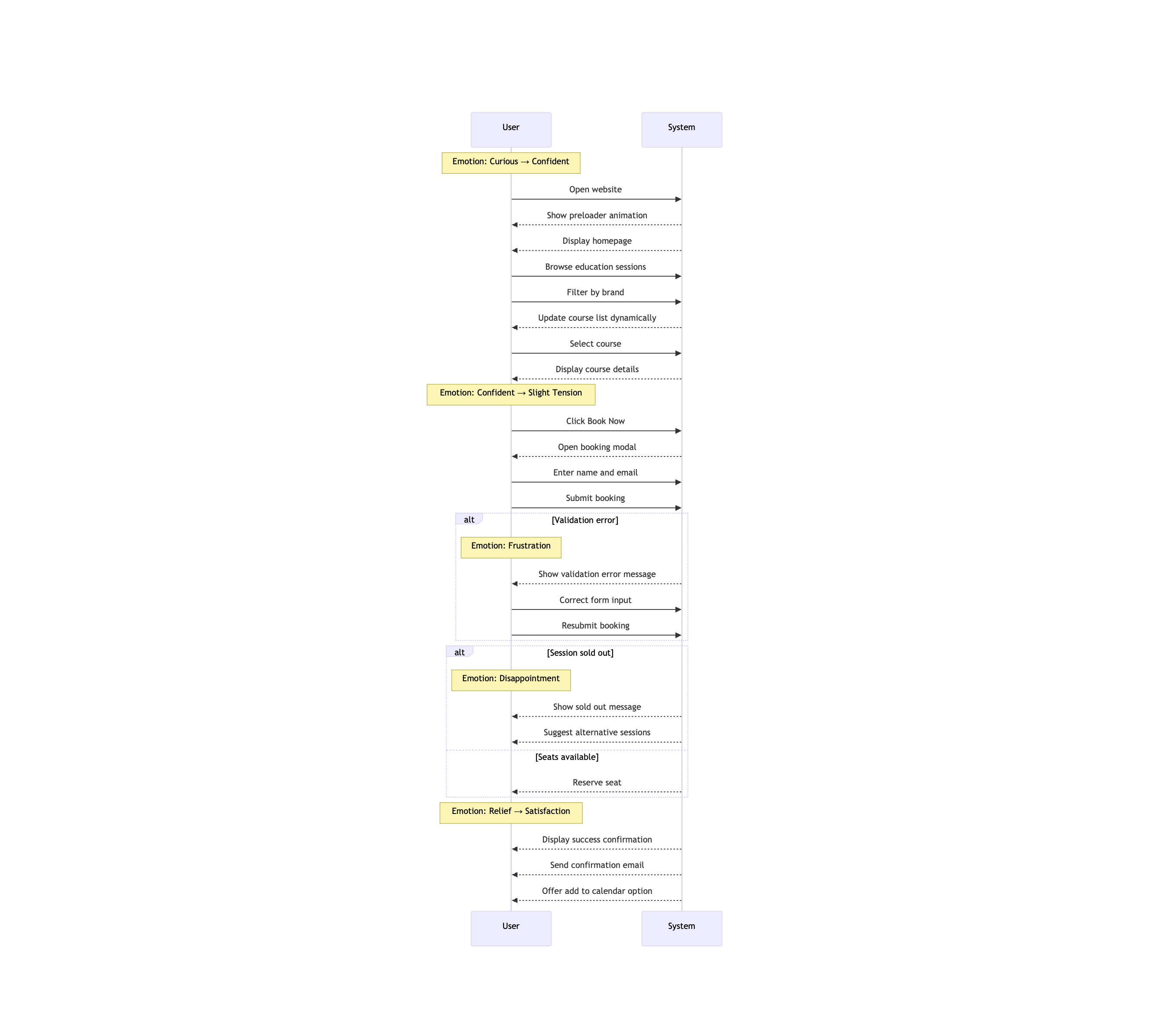
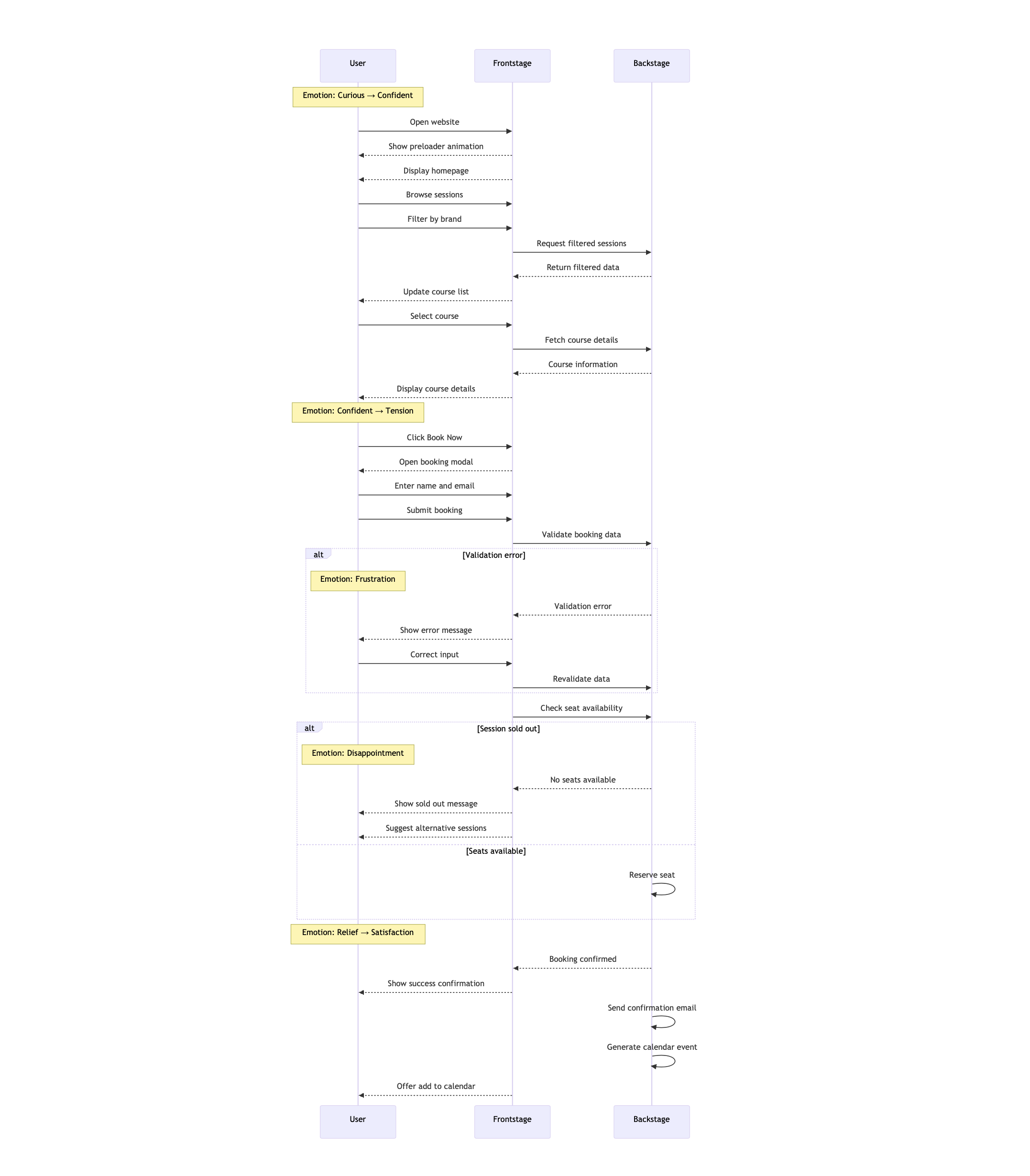
Core Challenge: How can we help busy beauty professionals quickly discover relevant courses and reserve spots without friction or information overload?
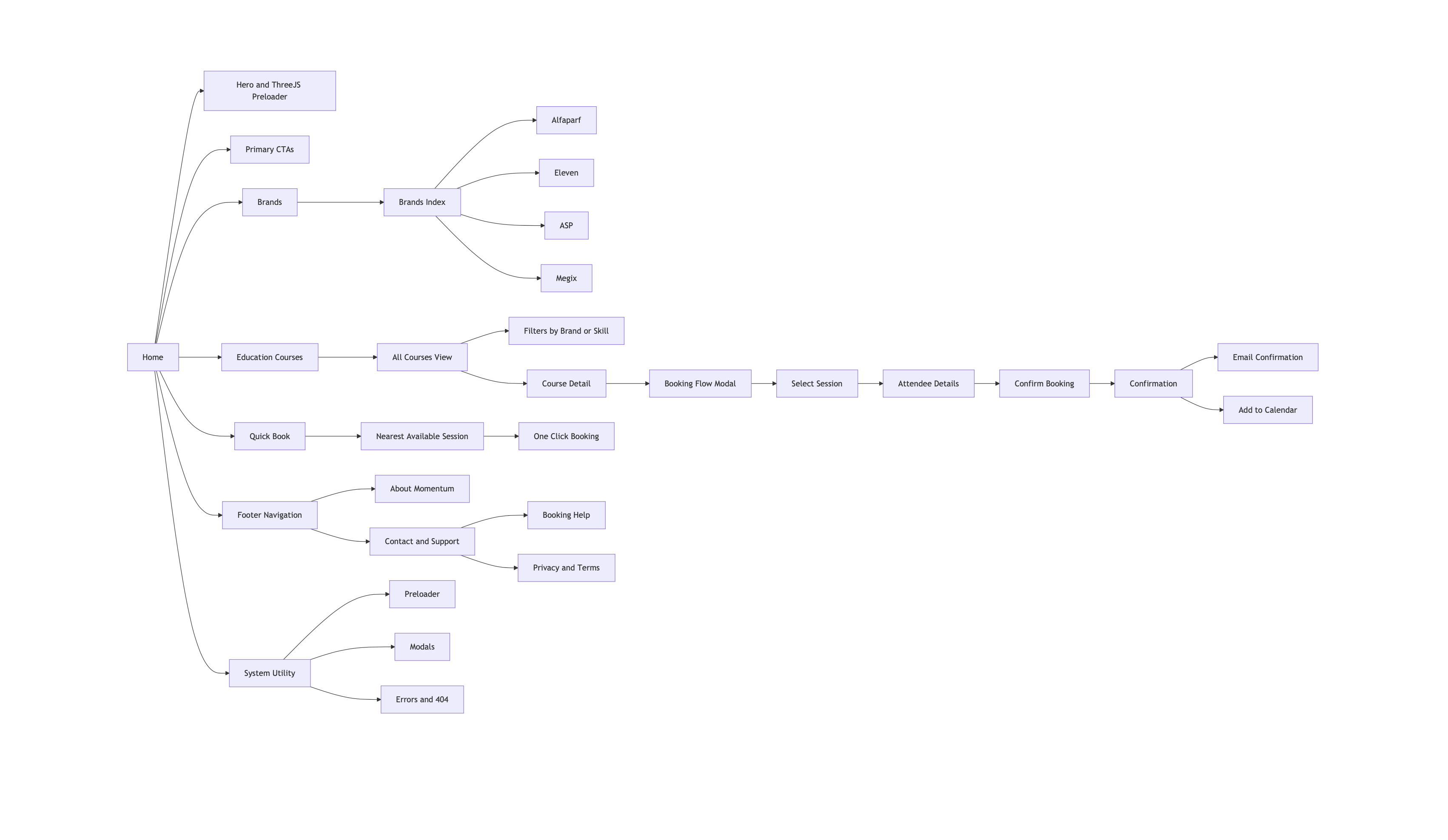
- Multiple beauty brands (Alfaparf, Eleven Australia, ASP, MEGIX)
- Fragmented course information across brands, locations, and dates
- Time-constrained professionals struggling to compare offerings
- Complex booking processes requiring multiple steps
8
User Interviews
Beauty professionals
5
Competitors Analyzed
Education platforms
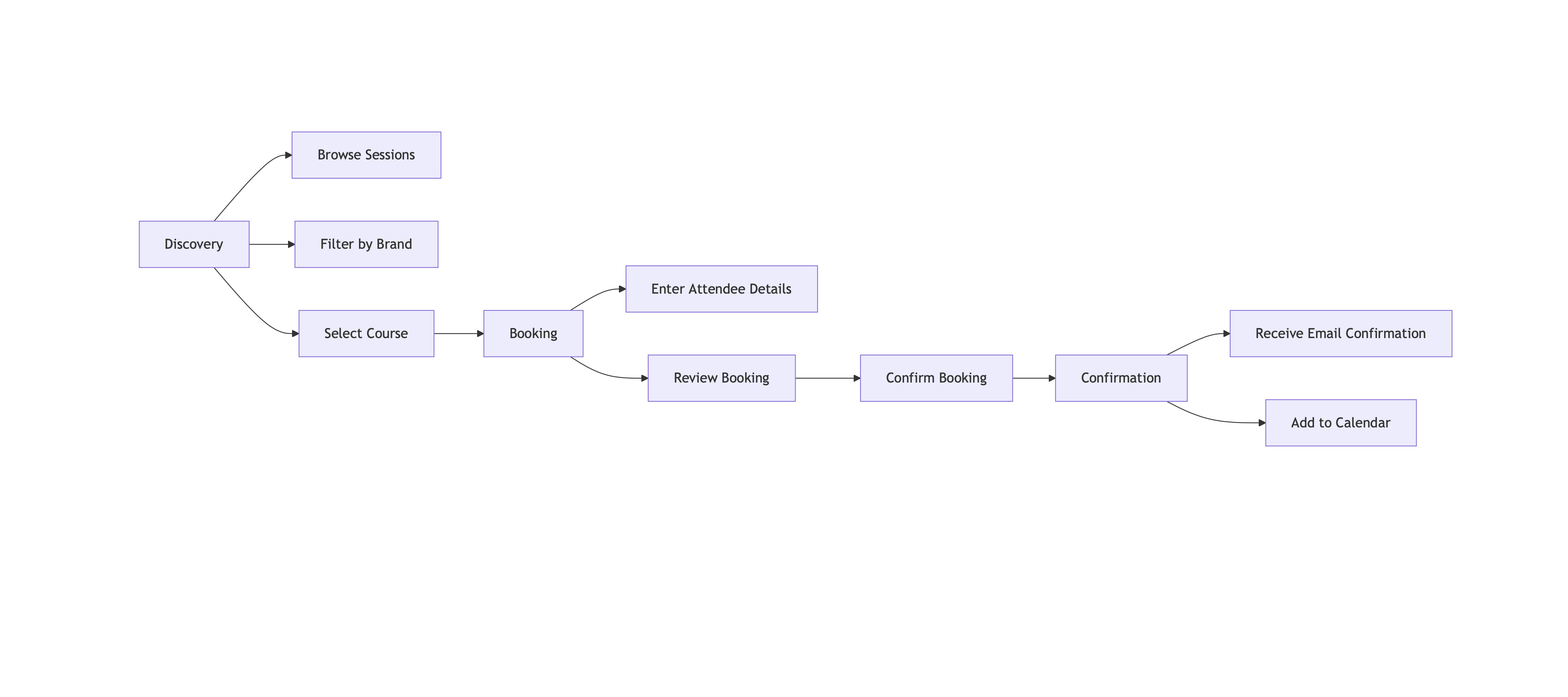
3 Steps
Booking Process
Down from 7+ steps
75%
Time Reduction
Discovery to booking