"We want to feel proud showing our culture to our kids, but also not look outdated to younger generations"
— Community stakeholder interview
Older generations wanted traditional symbols; younger generations found them "cringe." Both wanted to feel proud.
Impact: Led me to develop a visual language that honored traditional Portuguese elements (azulejo patterns, maritime history) but executed with contemporary design principles—bold typography, vibrant colors, clean layouts.
Portuguese wasn't just a translation requirement—it was central to cultural identity. Code-switching between Portuguese and English was natural for the community.
Impact: Designed bilingual experiences where both languages had equal visual weight and hierarchy, rather than treating Portuguese as secondary. This became the foundation for the voice-activated installation.
Younger community members consumed content digitally but valued the in-person pavilion experience deeply as family tradition.
Impact: Created digital-first awareness campaign with QR codes linking to physical experiences, treating online and offline as one continuous journey rather than separate channels.
Community members wanted to contribute content, not just consume it. Previous years felt "designed at them" not "with them."
Impact: Implemented user-generated content strategy where community shared their stories, photos, and traditions. 85% of social content became community-sourced.
Developed complete visual language including color palette, typography system, iconography, and design principles.
Impact: Created 47-page brand guidelines that volunteers could reference independently
Designed and coded portugalcarassauga.ca from scratch using React, including bilingual content management.
Impact: Achieved 95% accessibility score and 100% mobile responsiveness with zero development budget
Conceived and built voice-activated multilingual slideshow using Web Speech API and GSAP.
Impact: Created most talked-about installation at the festival—visitors spent average 8 minutes interacting
Planned and executed 40-day campaign across Instagram and TikTok with daily content.
Impact: Grew following from 287 to 2,400+ with 100% engagement increase over previous year
Designed menus, passports, wayfinding signage, VIP invitations, and coordinated print vendor production.
Impact: Delivered all collateral on time and under budget through strategic vendor relationships
Created templates and workflows enabling volunteers to maintain systems post-launch.
Impact: Community successfully ran social media for 2 weeks during festival without my involvement
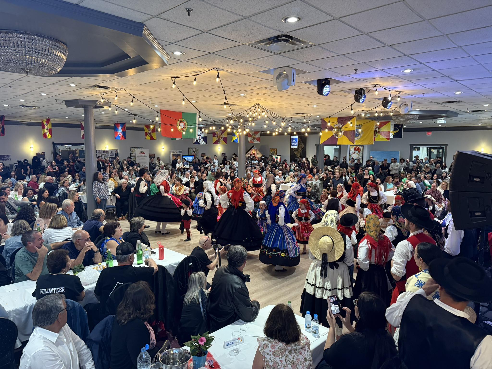
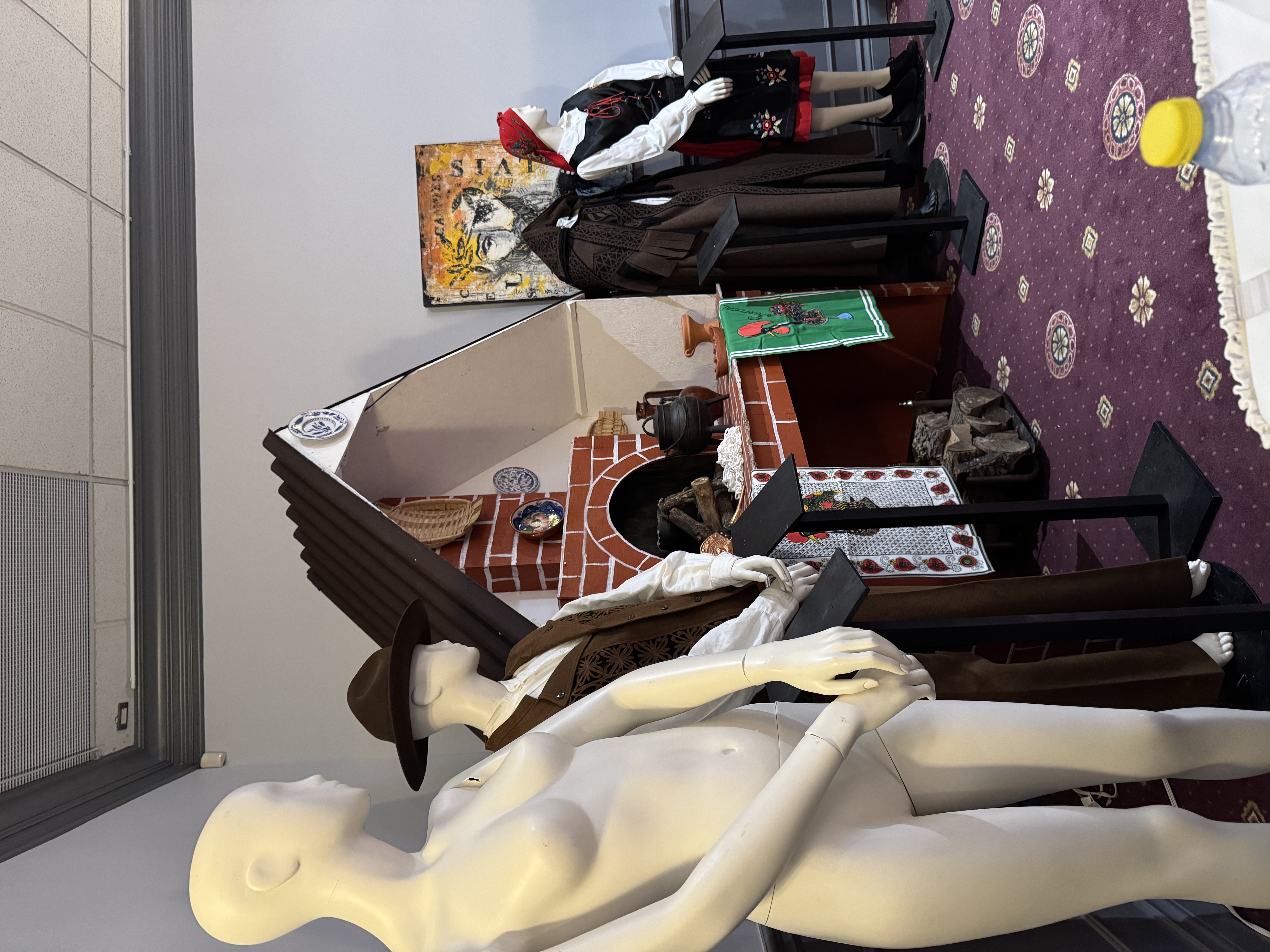
Challenge: Older stakeholders wanted traditional azulejo tiles and folk imagery. Younger community members found this "embarrassing" and "outdated."
Chosen: Cultural Abstraction
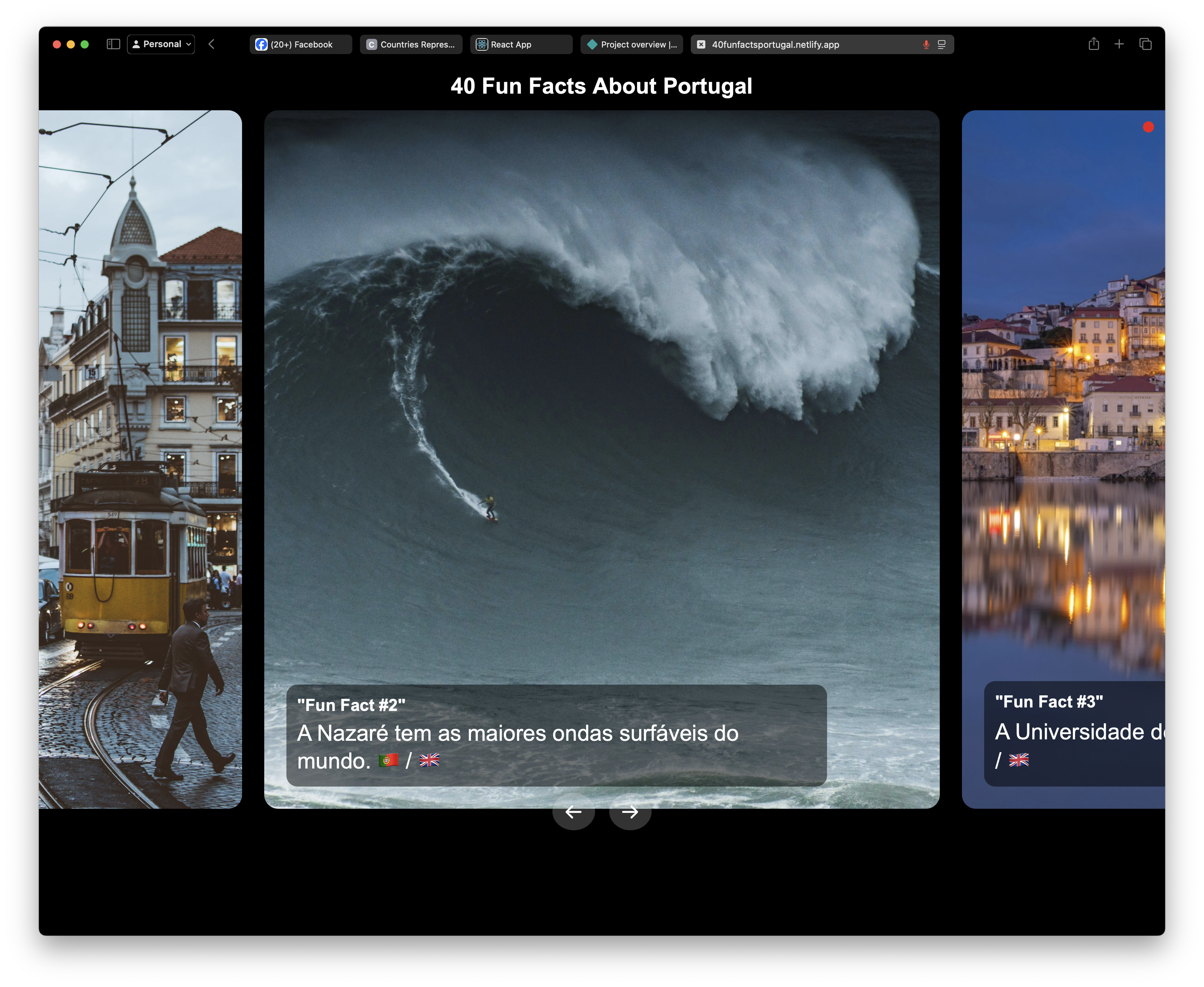
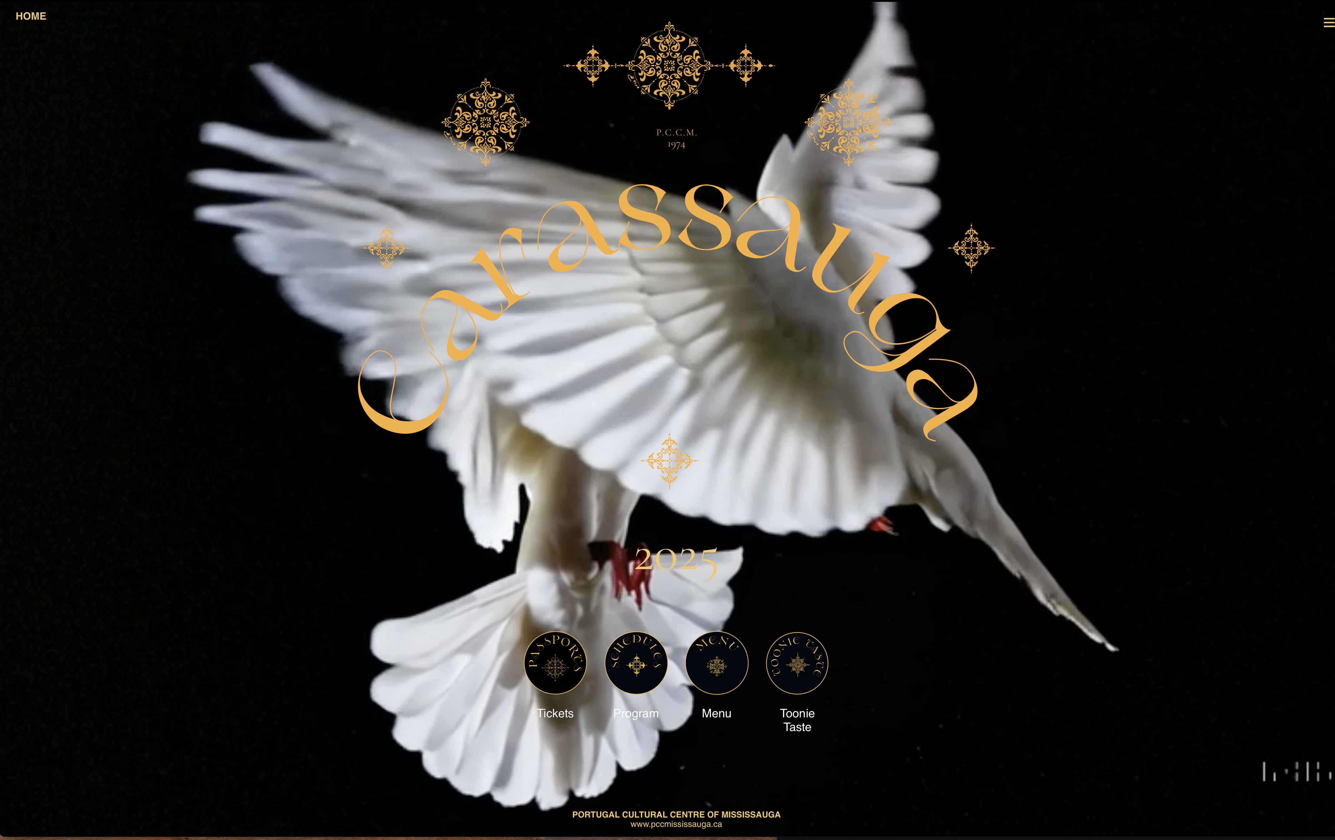
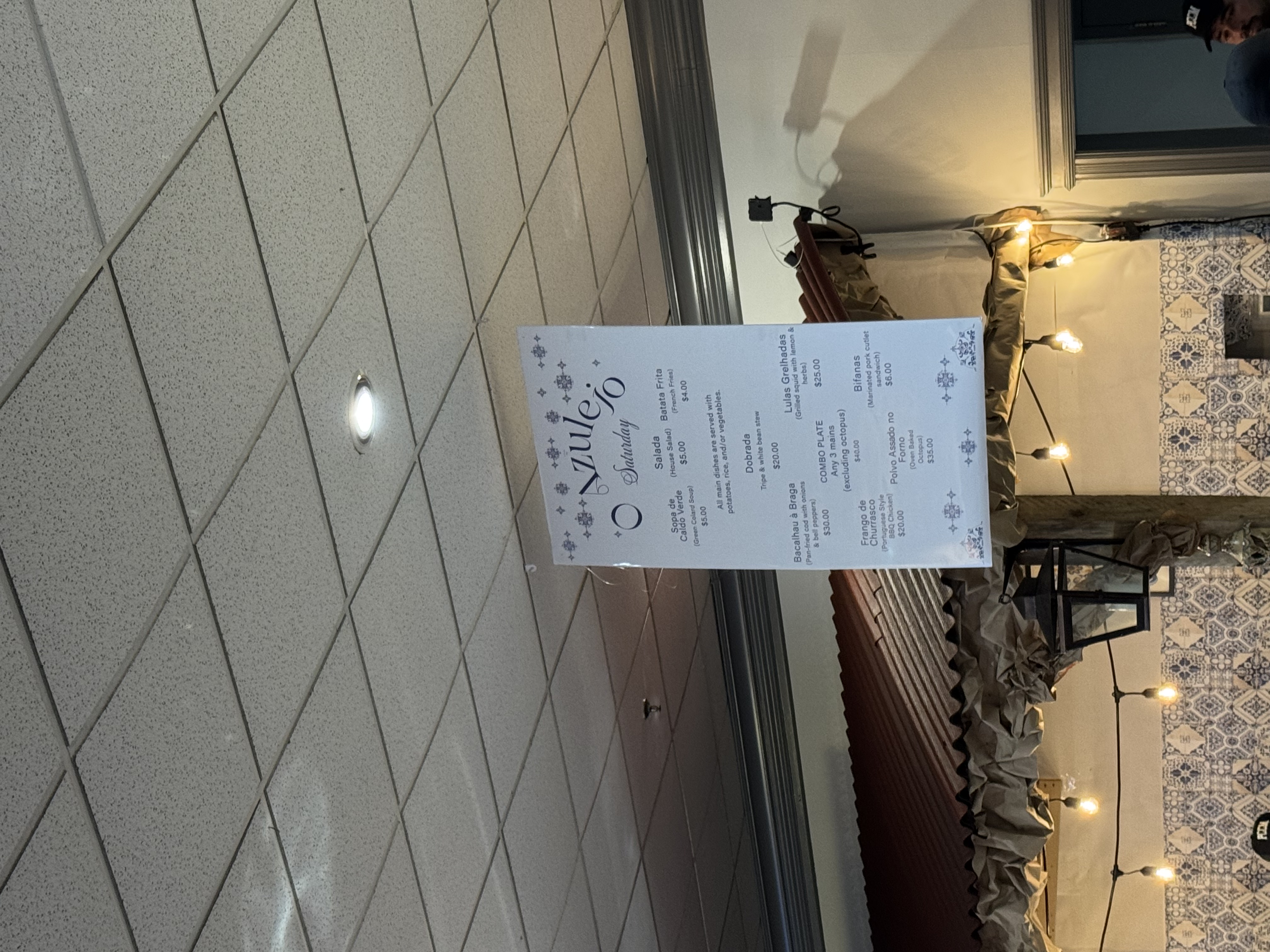
I extracted the geometric patterns from azulejo tiles and maritime navigation charts, then applied them as subtle textures and layout grids. Used traditional Portuguese colors (deep blue, terracotta, white) but with modern vibrant saturation.
Impact: Both generations felt represented—95% community satisfaction score. Design won praise from design community while feeling authentic to cultural members.
Challenge: Zero budget, 6-month timeline, but needed full bilingual support, accessibility compliance, and seamless integration with voice installation.
Chosen: Custom React Build
Website builders couldn't handle the complex bilingual requirements or integrate with voice-activated installation. Building from scratch gave me complete control over accessibility, performance, and cultural customization.
Impact: Achieved exactly what we needed with 95% accessibility score. Created detailed documentation so volunteers could update content without touching code.
Challenge: Community wanted to participate but lacked design skills. I could produce higher quality content alone but wouldn't feel as authentic.
Chosen: Hybrid Approach
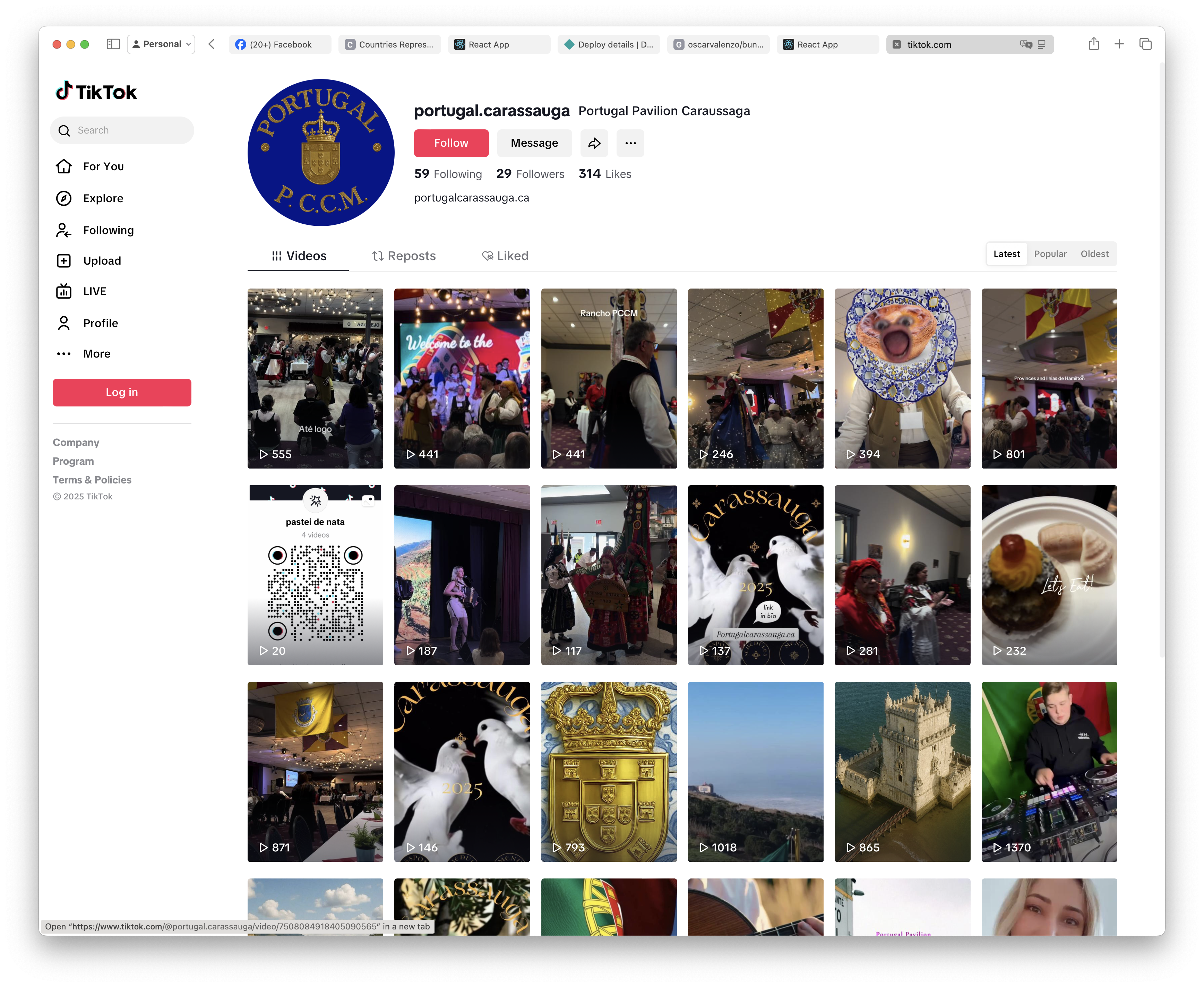
Built Canva templates with locked design elements but editable text/photos. Trained 5 volunteers on content creation basics. I quality-checked and posted but 85% of content ideas came from community.
Impact: Engagement rate 3x higher on community-sourced content versus my professional posts. Community felt ownership. Created sustainable model—they continued posting after festival without me.
React-based website with seamless language switching, mobile-first responsive design, and integrated ticketing/program info
Impact: 3x increase in schedule downloads, 2,400+ unique visitors pre-festival
Custom-built slideshow using Web Speech API that listened for clapping sounds to switch between Portuguese and English content
Impact: Average 8-minute engagement time, became most photographed installation at festival
WCAG 2.1 AA compliance, high contrast ratios, screen reader optimization, keyboard navigation
Impact: 95% accessibility score, praised by visitors with disabilities
Community-generated content with "imperfect" execution outperformed my polished professional posts by 3x engagement. Authenticity mattered more than polish.
Abstracting traditional cultural elements into contemporary design language allowed both older and younger generations to feel represented without compromise.
Zero budget forced creative solutions (custom React build, Web Speech API) that became the project's most memorable elements. Constraints weren't limitations—they were design parameters.
Voice-activated installation succeeded because it enhanced human cultural exchange rather than replacing physical interaction. Technology should be the bridge, not the destination.
Treating Portuguese and English as equal visual languages (not translation) fundamentally changed how community experienced the design. Language hierarchy communicates value.